Bento Grids Are Transforming Web Design with Modular Magic
The Essence of the Bento Grid in UI Design
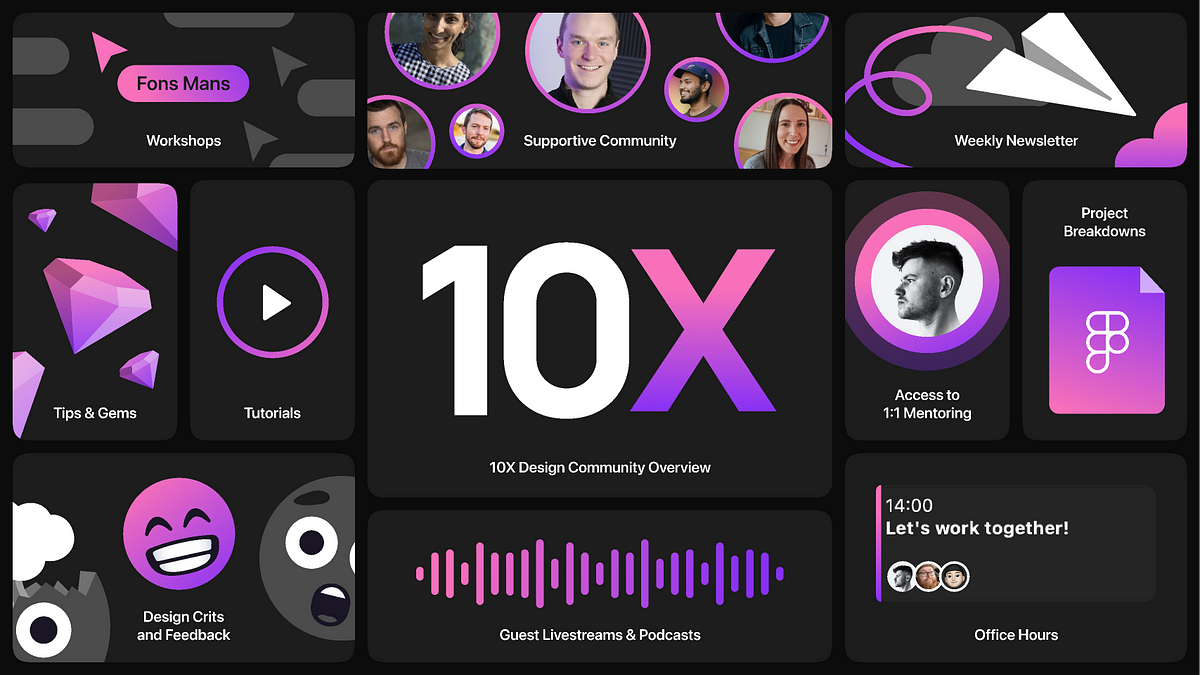
At its core, a bento grid design breaks down a webpage into a series of distinct, often irregularly sized, visual sections or "boxes." Each box serves as a self-contained module, presenting a specific piece of content, an interactive element, or a visual asset. Unlike traditional symmetrical grids, the bento grid embraces asymmetry and varying proportions, creating a dynamic yet organized layout that draws the eye and guides the user through information.
This aesthetic is not merely about visual flair; it’s deeply rooted in functional benefits. By compartmentalizing content, bento grids help manage information hierarchy, reduce cognitive load, and provide clear visual segmentation. This makes complex data digestible and user interfaces intuitively navigable, enhancing the overall user experience. It’s a sophisticated way to achieve balance and visual interest while maintaining order and clarity.
Why Modular Design is Reshaping Web UX
The rise of the bento grid is a testament to the broader shift towards modularity in digital design. This approach offers numerous advantages that resonate with both designers and users:
Enhanced Visual Appeal
The varied sizes and arrangements of "boxes" create visually engaging layouts that feel modern, clean, and often more artistic than traditional grid systems. This fresh aesthetic can immediately capture user attention.
Improved Information Hierarchy
By dedicating specific compartments to different types of content, designers can clearly prioritize information, guiding users through the most important elements first.
Increased Content Scannability
Users can quickly scan distinct sections to find the information they need, reducing search time and frustration.
Adaptability and Responsiveness
Modular components are inherently easier to adapt across different screen sizes and devices. Designers can rearrange, resize, or stack modules fluidly to ensure optimal viewing on desktops, tablets, and mobile phones, ensuring a seamless UX across all platforms.
Scalability and Maintainability
For development teams, a modular approach means components can be built, tested, and maintained independently, leading to more efficient workflows and easier updates. This aligns perfectly with modern design system methodologies.
The bento box analogy perfectly encapsulates this design philosophy: a collection of diverse, well-organized elements that come together to form a cohesive and satisfying whole. As users increasingly expect intuitive and visually rich experiences, the principles of modular design, epitomized by the bento grid, are set to define the next generation of web and UI design, proving that sometimes, the most revolutionary ideas come from unexpected places. Explore more about the principles of responsive web design or delve into the power of design systems in UX.
Did you find this article helpful?
Let us know by leaving a reaction!